From ‘Waldo’ to ‘Bomb Pop’ to World Cup winners: The best kits worn by the United States
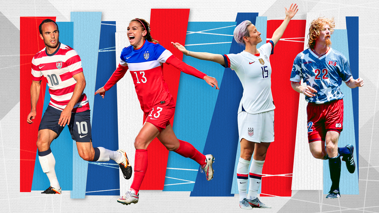
When Nike revealed the uniforms last week for the United States men’s and women’s national teams for the upcoming World Cup tournaments, responses ranged from muted to borderline mutiny.
To recap: The home kit for Qatar 2022 is a plain white shirt with some neckline and sleeve accents, while the away counterpart is an abstract and muddled mix of two blue tones. You’re not missing much.
Part of the backlash to the kits stems from the U.S. teams’ having worn some pretty memorable ones on soccer’s biggest stages, even if there isn’t a signature look a la France‘s Maillots Bleus, Argentina‘s Albiceleste or Brazil‘s Canarinho.
But for whatever reason (the minimal look is still in, concern of the men not qualifying again, or maybe a really sharp fit is under wraps until the 2026 tournament?), this year’s version falls far short of anything collectible-worthy.
Nonetheless, that doesn’t stop us from at least reminiscing and stepping into the way-back machine (or at least to 1991) to rank the best U.S. kits ever donned.
– Stream on ESPN+: LaLiga, Bundesliga, MLS, more (U.S.)
10. The “Fantastic Four” | 2019 World Cup
The kit that claimed the USWNT’s fourth World Cup star to the crest. Inspired by the 1999 side, this version started the recent trend of white home kits with understated accents around the collar and the sleeves.
It’s frankly not much different from what we’ve seen lately, but winning (and photogenic moments) cures all. We all remember Megan Rapinoe’s grand stance with her outstretched arms after her two goals against France in the 2019 World Cup quarterfinals. Just for that, it’s worthy.
9. The “What Could Have Been” | 2018 World Cup qualifying, USWNT’s 500th win
The gradient colorway of the bars gives a sense of an invisible diagonal sash, which the U.S. has used effectively in the past (as we’ll note later). Here’s the thing, though: this one will likely best be remembered as the kit that would have been worn at the 2018 World Cup, and as such it’s hard to associate it with anything more than a prolonged reset period for the USMNT.
For the women, it was worn over Portugal in a 2018 friendly for the squad’s 500th all-time win.
8. The “Pinstripes” | 2007 Copa America
An example of how even the usual “stars, sashes and stripes” motif can also be revamped. Does the combo of royal blue and thin pinstripes give a “1970s leisure suit meets the New York Yankees” vibe? Yeah, but the vintage feel and solid white collars mesh well, especially when donned with the red-lined white shorts.
That it was worn only at the 2007 Copa America in Venezuela, where the USMNT was one of the guest teams, also gives it some allure.
7. The “Old School Red” | 2006 friendly vs. Latvia
Red has come up on occasion as the primary color of the U.S. look, which allows the kits to pop more. In this example, it was worn once in a send-off match before the 2006 World Cup, but the old-school crest, floppy collar and dual-colored sash could have easily been the high point of an early tournament exit.
The whole “Don’t Tread on Me” snake sleeve patch looks like a last-second addition, though.
6. The “Bloodied Sidebar” | 2006 World Cup
If this had been paired with the above kit at the 2006 tourney in Germany, maybe things could have gone differently for Brian McBride and the USMNT.
Design-wise, it feels lopsided as the off-center bars look like one strap of a pair of overalls or perhaps of German lederhosen. But since it was worn in a memorable and feisty 1-1 draw against eventual champs Italy (their sole blemish on way to the trophy), it has a place here.
5. The “Retro Sash” | 2010 World Cup
It might not even be the U.S.’s best sashed kit, but as in the previous World Cup cycle, Nike directly dipped into the country’s soccer lore and paid homage to the 1950 squad that famously drew against England. That the USMNT drew the Three Lions once more 60 years later in South Africa only amplified this look’s mystique.
The dark blue-into-obsidian background with a centered, symmetrical sash on a chilly Rustenberg night? Pretty iconic.
4. The “Reverse Waldo” | 2017 Gold Cup
The name will make sense later, but this is yet another World Cup-worthy look that was instead showcased elsewhere.
Some drawbacks on the design: the numbers seem superimposed and the white stars on the shoulders look like a garish epaulette. But the revamped crest with the hooped look, which was used several years earlier with success, is one of those that could easily be a signature and identifiable template for the U.S. teams.
3. The “Bomb Pop” | 2014 World Cup (USMNT), 2015 World Cup qualifying (USWNT)
There was a range of emotions when this shirt dropped, and not just because it resembles the least-bought item from an ice cream truck.
Did Nike run out of electric red fabric when it started on the chest and shoulders? Perhaps, but the bright colors and the blocky layers were an unexpectedly welcome refresh following years of nostalgia-driven looks.
It’s a can’t-miss — visually and literally — and always stands out among the crowds at U.S. matches.
T-2. The “Denim” and “The Things to Come” | 1994 World Cup (USMNT), 1991 World Cup (USWNT)
These two Adidas classics merit recognition, not just for their design but for what they did for the sport in the country. For the men, those stretched Starter-jacket-esque stars on a stonewashed denim-inspired background worn at the 1994 World Cup further propelled the popularity of the sport (or maybe it was all those amazing hairstyles).
Three years earlier, the women claimed their first of now four world titles, beating Norway at the inaugural tournament held in China. The trademark Adidas three bars are the main feature here, but their positioning in a diagonal, almost-sash look helps the blue and red blocks pop out.
It doesn’t hurt that you have so many pioneering legends here, as well.
1. The “Waldo” | 2013 Gold Cup (USMNT), 2012 Olympics (USWNT)
To be known by the title character of a series of books likely to be found in dentist waiting rooms — and still top the list — says something.
The iconic kits from around the world all have a signature palette, color, something. For the U.S., why can it not be the hoops look?
As seen here, it balances the white and color for it to work as either a home or away kit. It plays off the national colors without being just a copy of the flag. It’s unique because not many squads out there go horizontal. It just works.