Ranking every Women’s Champions League kit in league phase
With Arsenal coming in hot as defending champions, the UEFA Women’s Champions League league phase is scheduled to begin on Oct. 7 after the final eight clubs navigated their way through the qualifying rounds to reach the main draw.
Now we finally know the 18 teams involved — which includes some of European football’s biggest clubs, as well as a handful of slightly more obscure teams from around the continent — it’s time we assess the 2025-26 home, away, and third kits they will be wearing while competing.
We’ve got plain kits and patterned kits, kits inspired by landmarks, kits inspired by stadiums, kits inspired by ancient civilizations and even kits created in collaboration with one of the greatest basketball stars of all time.
There is also an inordinately high number of out-and-out, nostalgia-heavy, retro third-kit designs in the mix this season, with some hitting the mark more than others.
With almost 50 offerings, all of the kits have then been pored over and ranked in order accordingly, from top to bottom, and purely in terms of the aesthetics on display — or lack thereof!
Austrian side St. Pölten play in a blue jersey that has a very faint “zigzag” effect added to the material to lend a smidgen of dynamism to the proceedings. Unfortunately, all of that has been well and truly carpeted over with a wild array of sponsor logos, which has the unfortunate effect of making their players look — more than usual — like walking billboards. The away kit is just the same again, but in red.
Valerenga’s new home jersey is almost identical to last season’s design, with the only notable difference being the stripes on the shoulders, which have switched from white to red this time around. Other than that, it’s fairly basic fare from the Norwegians, who have now successfully qualified for the UWCL group stage in back-to-back campaigns.
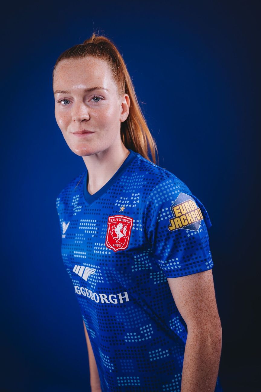
44. FC Twente home (Castore)

Twente qualified for the Champions League group stage with a lively 8-1 aggregate win over Polish hopefuls GKS Katowice, but unfortunately, the same can’t be said about their home kit, which consists of a plain red shirt with a “Harlequin” diamond pattern thrown in to help lighten the mood. The results are meager at best.
43. Valerenga away (Adidas)
Valerenga’s away kit is just a predictable color inversion of their blue, red and white home strip, which is hardly the most inspired choice of direction. In truth, it’s little more than a template, but the nice, bold and enjoyably retro “V.I.F” club crest is worthy of mention.
42. FC Twente away (Castore)
Marginally more interesting than their home shirt, Twente’s 2025-26 away kit is blue with a digital dot graphic, which is inspired by the cobblestone walls of the old Het Diekman Stadion; the Dutch club’s home from 1965 until 1998, when it was torn down and replaced by their current base, De Grolsch Veste.
41. OH Leuven home (Stanno)
The Belgian club has represented its traditional club colors in pinstripe form by etching lines of red, black and green over the top of their white home shirt. Nothing fancy.
40. Valerenga third (Adidas)
Decked out in all green from head to toe, Valerenga’s third kit once again falls firmly into the generic category with little else in the way of style or flourish to crow about.
39. Benfica home (Adidas)

Fundamentally unchanged for over 100 years, there is almost nothing new or interesting about Benfica’s latest home kit. Obviously, staunch tradition dictates that the Lisbon club play in red with white trim, and it would appear that the chunky black blocks of collar-and-cuff trim are the closest we’re ever going to get to innovation.
38. Benfica away (Adidas)

A basic color inversion of their home kit, Benfica’s white away jersey does at least come with a shimmering diamond-shaped pattern sublimated within the material to provide some much-needed character. Adequate and generic in equal measure.
37. OH Leuven away (Stanno)
Leuven’s brand new away kit is altogether hipper than the home version, with a deep mossy-green striped design chosen for the base and a lighter shade of slime green selected for the various appointments. While a shirt the color of both moss and slime doesn’t sound overly promising, the result is relatively funky.
36. Juventus away (Adidas)
Possibly one of the most over-egged football kits we’ve seen this season (and that is saying something), Juve’s pale blue away shirt is a hopelessly confusing muddle of overlaid graphic prints. For unknown reasons, a liquid droplet effect was applied to what was an already quite busy maze-like tile pattern, and the resulting chaos is really rather nauseating.
35. Chelsea away (Nike)
Somewhat loosely modeled on the white, red and green away kit that Chelsea released in the 1970s as a tribute to the Hungary national team, the contemporary equivalent is built upon an off-white base and features the very daintiest of pinstripes running in a column down the middle of the shirt. In testament to its curious heritage, the Chelsea men’s team wore their original 1974-75 vintage during a season that saw them suffer early elimination from both cups before being relegated from the First Division for the first time in over a decade. Magical times.
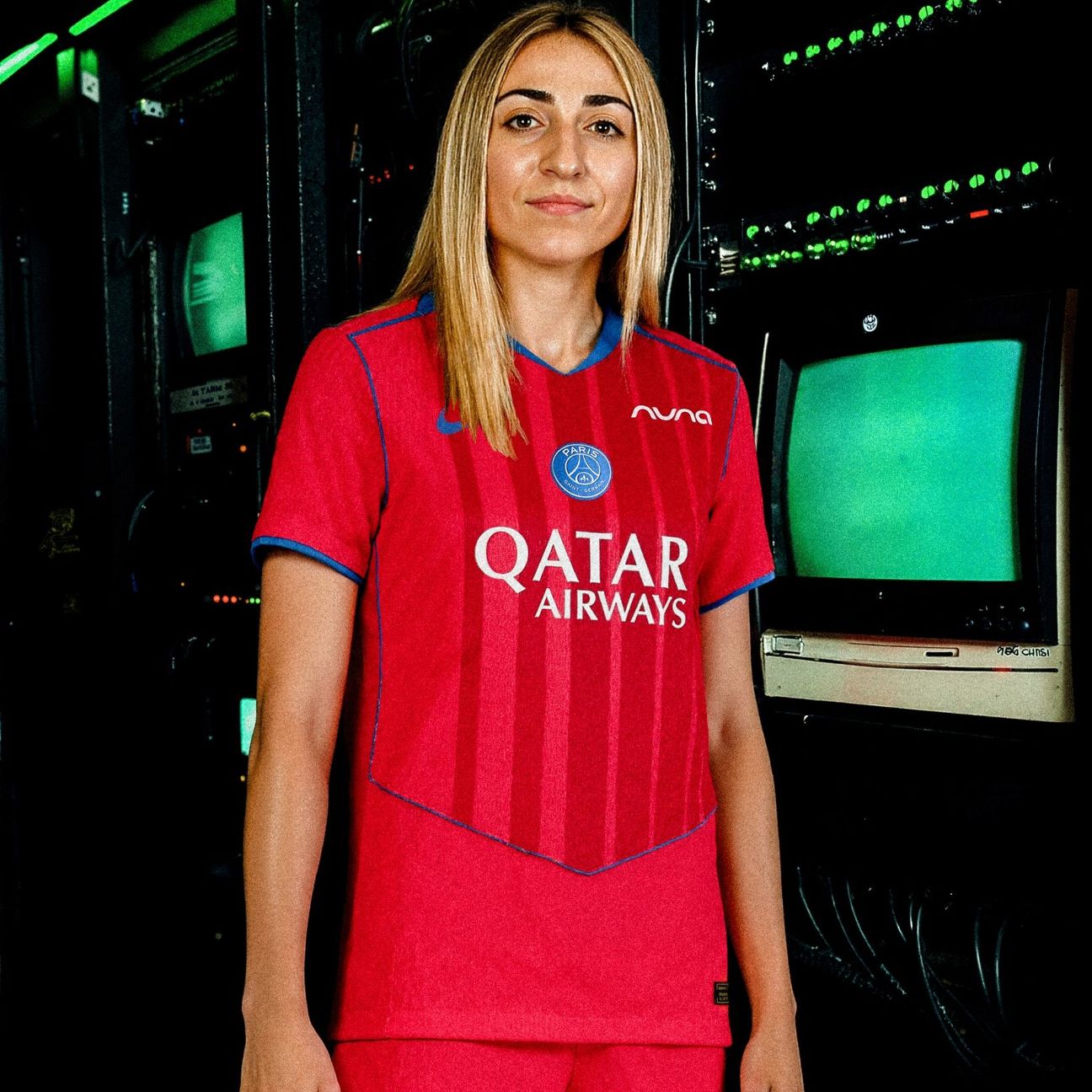
After deciding to roll over last season’s away kit into 2025-26, PSG are actually in possession of two kits inspired by the French capital’s most renowned landmark, with the white away kit bearing a stylized “painting” of the Eiffel Tower across the front like some kind of Parisian tourist information pamphlet.
We thought we might warm to Bayern’s new home kit over time, but alas, that is not the case, with the oddly frumpy design failing to win us over/grind us down since it was first unveiled back in June. The big “M” graphic is supposed to imbue the shirt with the Munich spirit, but sadly, it just looks blurry and unfinished to us. A swing-and-a-miss from the Bavarian giants.
32. Chelsea third (Nike)
Perhaps the weakest of the new “Total 90” range, the Blues’ ultra-bland third kit somewhat erroneously harkens back to an era when, while enjoying a major upturn in fortunes (quite literally), the club was actually wearing Umbro strips. Instead of those halcyon early-Mourinho days being invoked, we’ve actually been saddled with the return of “Boring, boring Chelsea.”
It’s incredibly difficult to pull off a grey kit without it looking inert and drab, and we’re afraid to say that Wolfsburg just haven’t managed it here. What is supposed to look silky, sleek, and space-age is actually more reminiscent of a dreary, overcast day in Lower Saxony.
30. Chelsea home (Nike)

While not exactly generic, we can’t claim to be excited by Chelsea’s new home kit, which is a plain royal blue number with a glitchy graphic imbued in the fabric that is made up of various archways, pillars and rooflines found on local civic buildings, including the Chelsea Town Hall.
29. Wolfsburg home (Nike)
Having dabbled in a much lighter tone for a couple of seasons, Wolfsburg are back in deep, forest green for 2025-26, though it must be said that the home shirt is unlikely to go down as a classic. The swirling, almost tie-dye graphic does lend a modicum of visual interest, but unfortunately, the home kit has since had its thunder well and truly stolen by the German club’s fantastic new limited edition 80th anniversary trikot, which was unveiled a few weeks ago.

28. Paris FC home (Adidas)
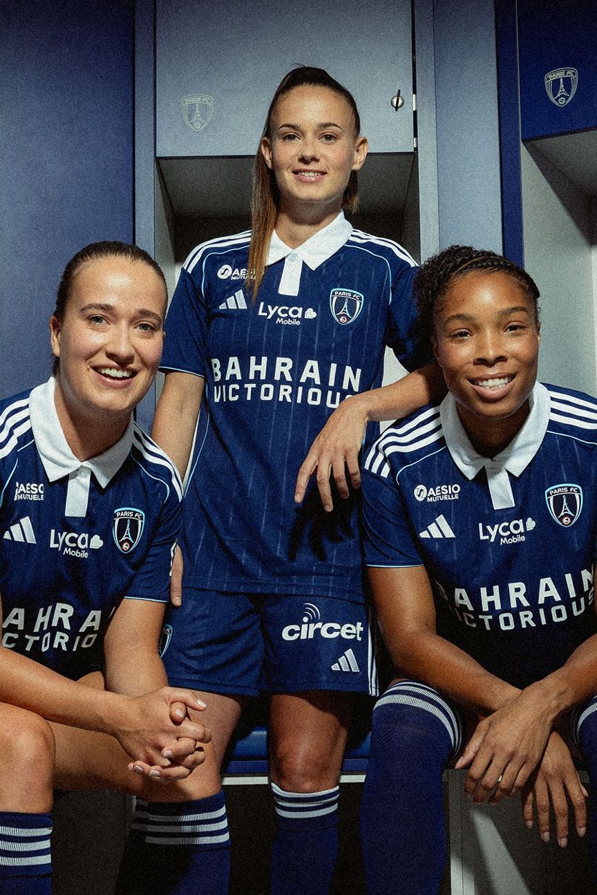
There is more than a whiff of Rugby Union emanating from Paris FC’s latest home stripe, which is dark blue with light blue trim, pinstripes and a large, white button-up collar. There’s nothing to upset the casual onlooker, but by the same token, not much to stand it out from the crowd either.
Apparently cobbled together from bits of OL Lyonnes’ most popular away kits (without really resembling any of them), the 2025-26 model is a simple dark navy shirt with red and blue pinstriping. The tricolore is reassuringly Gallic and perfectly amenable, but there’s not an awful lot else going on.
26. AS Roma away (Adidas)
A blazing flash of fiery orange, the Roma away kit is a history lesson in shirt form and apparently draws inspiration from Romulus and Remus, who are symbolic figures in the stories of Ancient Rome and its origins. The twin brothers are the sons of Mars, the Roman god of war and whose mighty lightning bolt can be seen crackling across the front of the jersey. Loud and dramatic, while still maintaining a certain refined air.

Real’s inky-blue away kit is intended to look like the Bernabeu by night, with a vague glimmer woven into the fabric to replicate the way their newly-renovated mega stadium glints like a giant silver air fryer plonked square in the middle of downtown Madrid.
24. Paris FC away (Adidas)
A white jersey with a dual-tone blue sash running diagonally across the torso. As with the home kit, the adopted Latin motto of the city of Paris (“Fluctuat Nec Mergitur/Tossed but not sunk”) is stamped across the back of the neck to add a nice personal touch to what otherwise is a fairly nondescript design.
23. Bayern Munich away (Adidas)

Compared to their gaudy home shirt, Bayern’s 2025-26 away is mercifully understated with a faded grey-and-coral tone “camo” pattern intended as an homage to the Allianz Arena by being made up from various different swatches and swathes of the stadium’s architecture and external cladding.
22. AS Roma home (Adidas)
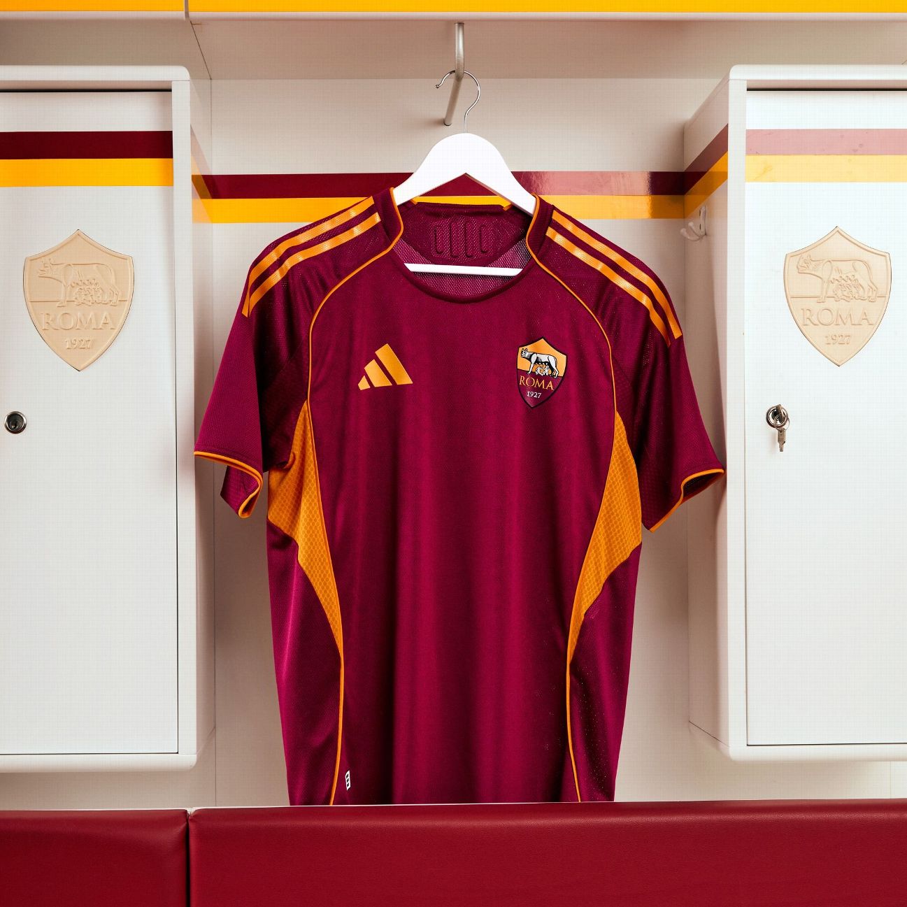
Not the strongest of Roma’s recent home shirts. The 2025-26 iteration still gets the job done, but it’s impossible to see past the basic teamwear template being served up. It is intended to resemble the classic home shirt of 1992-94 (the one in which a young Francesco Totti made his debut), but beyond the deep orange trim, the similarities are tenuous at best.
21. Real Madrid home (Adidas)

It’s getting increasingly difficult to be excited about a new Real Madrid home kit, given that the only differential year to year appears to be the color of the trim, which in turn seems to cycle through black, to gold, to purple, to blue and then back to black. This season it’s black AND gold.
20. Juventus home (Adidas)

Another contemporary twist on their classic aesthetic, this time Juve’s latest home kit has been given offset “barcode” stripes and pleasant pink trim. It’s certainly not the most egregious Nerazzurri home shirt in recent seasons (2023-24 takes that particular honor), but by the same token, we don’t think it will live overly long in the memory.
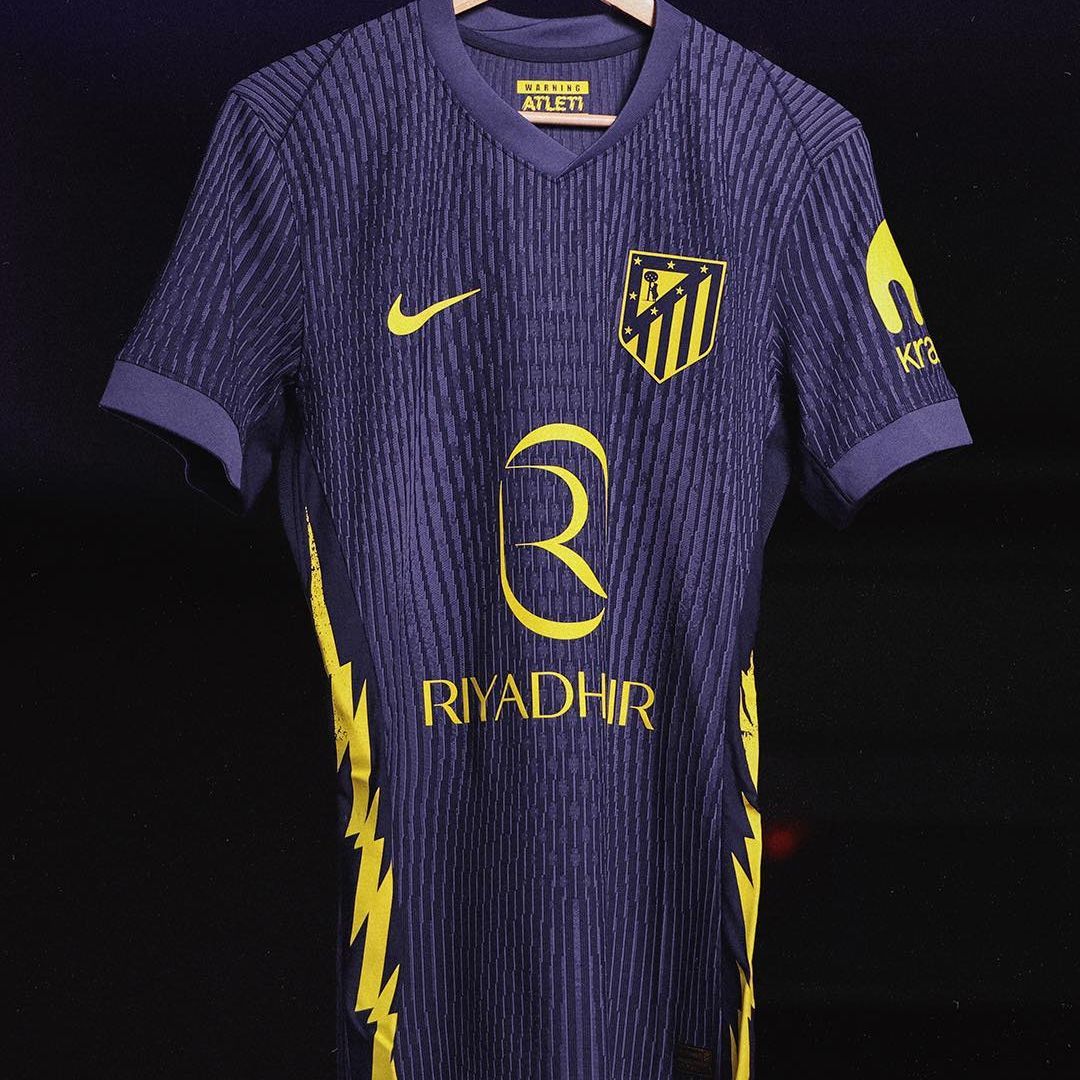
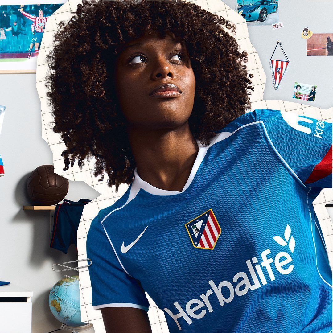
Atleti’s blue and yellow away kit is an ode to the rock classic that accompanies them out of the tunnel before home games, so that they might feel the pounding intro of “Thunderstruck” by AC/DC resonating within them wherever they travel. The jersey itself is fairly plain, but the lightning bolt shooting up each flank is a cute little detail.

United have once again gone back to mine their cult favorite “snowflake” away kit from the early 1990s for inspiration, this time enlarging the pattern and plastering it in a light mauve color over a white base. The trim is a dark, plummy purple. The original design has now been rehashed countless times over the years, but we guess it’s a classic for a reason.
17. OL Lyonnes home (Adidas)
Bearing the same red-and-blue stripes that first appeared on their shirts in the 1950s, Lyonnes’ new home kit is built on a fresh white base that carries a faint pattern inspired by mosaics as found in Lugdunum, the ancient Roman city that preceded Lyon. The rest of the trim has the slight whiff of the template about it, but all in all, it’s a smart if unspectacular jersey.

Created in collaboration with Kobe Bryant’s “Mamba Mentality” label, Barca’s gold-and-purple away kit is apparently infused with the late NBA legend’s inspirational approach to sporting greatness. The knit of the material offers a bit of additional texture to an otherwise bland template, but the inky blackout logos do at least give things a quirky edge.
15. Atlético Madrid home (Nike)
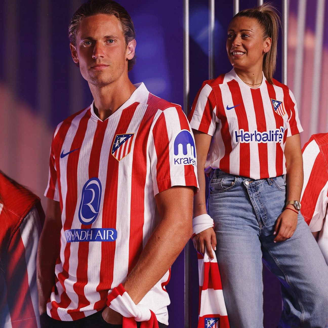
After muddling through a few experimental tweaks to the recipe, Atleti are back in their classic Rojiblanco stripes this season and looking all the better for it. Clean, uncluttered, and with just a hint of that early 2000s retro tang.
14. Paris Saint-Germain third (Nike)
Part of Nike’s revamped “Total 90” range, PSG’s retro third kit looks like it was air-dropped straight out of the early 2000s thanks to the shield-shaped panels, the central crest and the pointy flashes on the collar and cuffs. The gradient stripes also offer a little bonus razzle-dazzle to proceedings.
13. Arsenal away (Adidas)
Arsenal’s constant rehashing of their cult classic 1995-96 “lightning strike” away kit is getting a little stale now, with the club having repeatedly used it as the basis for several kit and retro apparel lines in recent years. The latest reworking in dark blue and silver is still easy on the eye (especially that lovely retro cannon crest), but maybe it’s time to move on.
12. Manchester United home (Adidas)

Manchester United’s 2025-26 home kit design is inspired by Old Trafford, the rickety old stadium that the men’s team have called home for many a decade. The result is a simple, traditional design with a solid red base and black-and-white trim, with patterns in the fabric inspired by the internal architecture of the ground itself. Hardly revolutionary, but a solid piece of shirt design nonetheless.
11. Barcelona home (Nike)
Back in familiar stripes after a season spent in a half-and-half design, the latest iteration of the Blaugrana sees a diagonal gradient added across the vertical bars that almost sees the red and blue fuse into a purple haze. Hardly a classic shirt by any stretch of the imagination, but it serves its purpose just fine.
10. Atlético Madrid third (Nike)
One of the more convincing examples of Nike’s “Total 90” throwback series, Atleti’s version is sky blue with period-correct white and red piping as used on their change strips of the mid-2000s, particularly 2004-05. The central crest placement also fits the bill rather nicely.
9. Arsenal home (Adidas)

Fairly straightforward traditional fare from Arsenal here, with the standard red-body-and-white-sleeves format followed to the letter. While hardly earth-shattering, their home kit is clean and competent and the old gothic-style “A” symbol (as first appeared on the Gunners’ old “Victoria Concordia Crescit” crest in the late 1940s) being worked into the material is a nice touch.
8. Paris Saint-Germain home (Nike)

A tribute to the instantly recognizable ironwork of the Eiffel Tower, PSG’s new home kit sees their famous red “Hechter” stripe recreated in a lattice of beams and girders. What might have been an overelaborate, chintzy mess is actually fairly subtle and subdued.
7. Barcelona third (Nike)
Arguably one of the better “Total 90” offerings, Barcelona’s glaring neon-orange third kit could at least pass for a training kit from the post-Millennium era, and it certainly looks better once the players’ names and numbers are applied. We’re not entirely sure what it is, but it still feels like there’s something crucial missing from these Nike throwback kits.
6. Manchester United third (Adidas)

Obviously influenced by the black-and-yellow “Cantona” away kit of 1993-95, United’s third shirt is oozing with ice-cold retro juice and has proved an instant hit among fans, who are presumably increasingly keen to hark back to the good old days.
5. AS Roma third (Adidas)
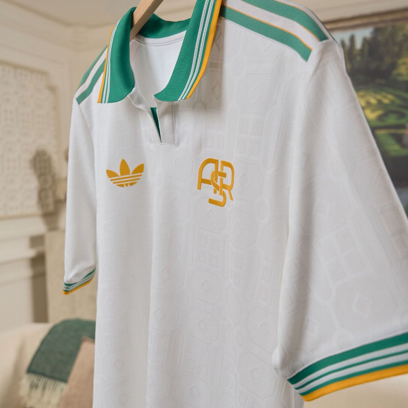
One of the many retro third shirts created by Adidas this season, Roma’s is razor sharp with the green trim and lush geometric pattern in the fabric, apparently supposed to mimic the manicured gardens found inside ancient Roman villas. The “ASR” trigram crest is also the perfect adornment for a shirt of such pure elegance.
4. Real Madrid third (Adidas)

Real’s third kit is a rather charming retro effort in bright blue with an unusual diagonal linear pattern in the fabric that is supposed to resemble rows of the new folding seats that have been installed in some areas of the Bernabeu stadium. Despite the slightly dubious creative impetus, it’s an absolute beauty and no mistake.
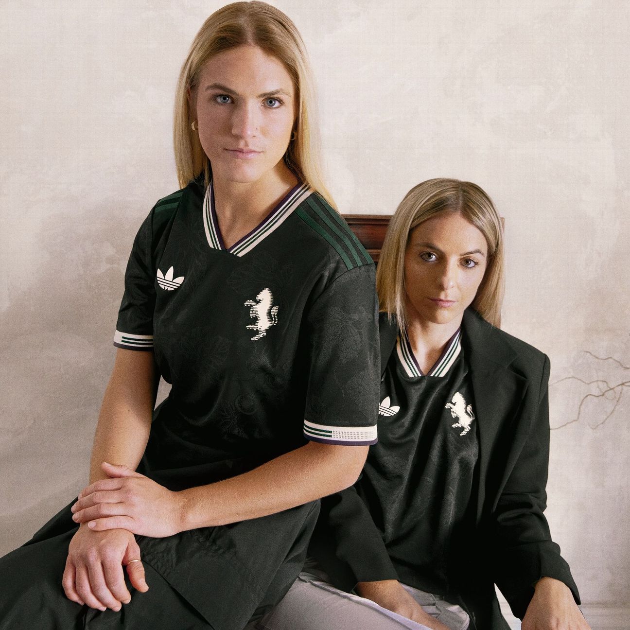
3. Bayern Munich third (Adidas)
The perfect anathema to Bayern’s big, ugly home shirt, the uber-refined retro third kit is understated while still being festooned with vintage appointments — from the subtle checkering in the fabric, to the gorgeous two-tone collar and cuff pattern, to the classic “FC Bayern eV” club crest dating from the 1920s.
2. Arsenal third (Adidas)
As crisp and sumptuous as fresh linen sheets, the Gunners’ retro-tinged third kit serves as a nod to former ground Highbury on the 20th anniversary of what was to be their final season playing at the club’s spiritual home. Dripping in Art Deco luxe, the ivory and dark red palette mirror the pristine marble halls inside the old East Stand, while the fabric is afforded an elegant drape thanks to a pattern inspired by the Victorian-style facade outside, built in 1936.
1. Juventus third (Adidas)
Inspired by fine wine and almost certain to age like it. The delicate vanilla-claret-and-olive trim is further enhanced by a delicate vine leaf pattern that glistens within the black fabric and resembles the kind of ornate flock wallpaper you might find in a particularly grand country house nestled within the vineyards of Piedmont. Prefetto, as the Italians might say.