MLS jersey Power Rankings: Who are 2024’s style icons?
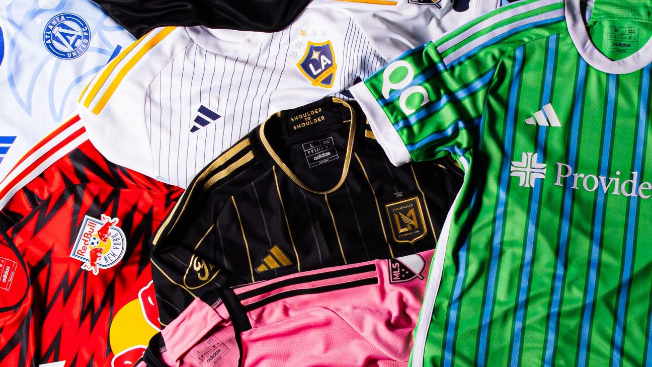
Remember the MLS days of plain white shirts with a crest and sponsor? Kits so bland that even copywriters could do little else than call them “clean”?
Thankfully, those days are gone as the league is delivering us some surefire heat now.
– Stream on ESPN+: LaLiga, Bundesliga, more (U.S.)
MLS teams and Adidas have opted for bold designs and lots of color in 2024, giving us kits that will leave few without an opinion. Some are phenomenal, and some missed the mark, but almost all are ambitious and evocative. That alone makes this a great year for kits.
Who scored a golazo, and whose shot went out for a throw-in?
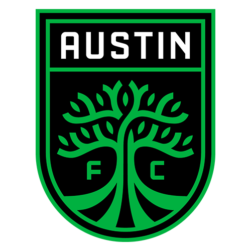
Paying homage to an influential part of Austin’s legend.
— Austin FC (@AustinFC) February 16, 2024
Cream-colored kits rarely work, and this isn’t one of those unique exceptions. It mutes the whole kit and is paired with a green that doesn’t even match the club’s typical shade.
What Austin thought it was giving us with this kit is unclear, but it’s safe in a year MLS went away from safe and it doesn’t really scream “Austin FC.” Take a bigger swing next year.

Get shopping our new 2024 home kit ????️ https://t.co/CVmkPUKTeO pic.twitter.com/IsUaB62O1I
— Inter Miami CF (@InterMiamiCF) January 29, 2024
There is only one thing keeping this kit from being this year’s worst: It’s pink.
You might say, “Why would you give a club credit for using its primary color on its primary shirt?” but remember those inaugural Inter shirts? They were black. So because they put the bar beneath the floor, they get credit for having a pink shirt.
Everything else about it is terrible, though. The Royal Caribbean anchor looks goofy, the center crest is a bad choice and the spacing between those two and the Adidas logo in the center isn’t even uniform. They’re lucky fans throw taste out the window when it comes to anything with Lionel Messi‘s No. 10 on it.
Like the fans who unite every matchday at CITYPARK, each jersey is unique. A tribute to every individual pushing STL forward. @Purina x @BJC_HealthCare x @adidasfootball
— St Louis CITY SC (@stlCITYsc) February 16, 2024
So, about the whole departure from the white-tee era. It might not have happened entirely. City’s kit is fine. There’s nothing necessarily wrong with it. There’s just not a lot there.
The club is calling this its “confluence kit” — those little lines are supposed to bring some texture to the shirt that evoke the city’s rivers — but it falls flat and it’s not even going to be “clean” once you spill some toasted ravioli on it.

Bringing the Global Toronto Area to the World. ????
Gear up with the official @TorontoFC kit here: https://t.co/7OZwNpdiVN pic.twitter.com/gfjAF0JyeF
— Major League Soccer (@MLS) February 15, 2024
TFC are in much the same place as St. Louis, but they have one big advantage on their white-and-red-attired friends: the crest.
The Reds have gone with their shield logo on the front of their kit for the first time and it looks great. It jumps off this otherwise plain kit and gives it a focal point that feels both fresh and completely TFC. A crest can’t make a shirt, but it gives Toronto a little edge relative to St. Louis.
A kit that signifies our intent.
— FC Dallas (@FCDallas) February 16, 2024
Credit to Dallas for trying with this kit, but it gets no credit for the outcome. The gradient look means the shirt is far more blue and purple than it is red on the front, but then the back of the shirt is red. And then the shorts are blue, so nothing about this kit looks cohesive or complementary.
It’s a mess.
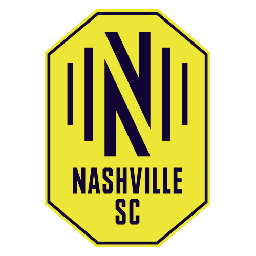
For the 615 ⭐️ pic.twitter.com/YlAnn3RKV4
— Nashville SC (@NashvilleSC) February 17, 2024
This is Year 5 of Nashville SC, and the only really clear visual identity it has had is its particular shade of yellow, so with this year’s kit, the club has … emphasized blue? There’s a blue stripe across the top of the shirt and Nashville is wearing blue shorts with its primary kit for the first time. None of this is inherently bad, but you’d hope that NSC would have more to hang their hat on aesthetically by now.
We’re proud to raise the Burgundy & Blue for Colorado.
Shop the One Flag Kit Now ???? » https://t.co/4IRud4m2Nk
— Colorado Rapids (@ColoradoRapids) February 16, 2024
The Rapids’ burgundy and sky blue has always been a really nice color pairing, so it’s a bit unfortunate they’ve never really had a great kit. This one is no exception, with the waving-flag design of the shirt giving a bit of needed eye candy but not really creating anything particularly special.
It’s too bad Colorado opted for burgundy shorts with this kit. If it had worn blue shorts that match the shirt’s trim, the whole look would be far better.
At our Home, Todos Son Invitados pic.twitter.com/Kt4M2fCSxm
— The Crew (@ColumbusCrew) February 16, 2024
Everyone has already called this the Charlie Brown kit, and they’re not wrong. Whoever green-lit this idea made a big mistake. Rival fans are going to find jokes on their own; you don’t need to give it to them.
That said, after the terrible years of the Crew wearing a black primary kit, anything yellow is good for a smile. Plus, every jersey looks better when you add a new star over the crest.
For every generation. The 50 kit.@intermedia_net | #ThisIs50
— San Jose Earthquakes (@SJEarthquakes) February 17, 2024
An anniversary kit should be memorable and the Quakes are celebrating 50 years, so this one should have been spectacular, but they went pretty basic. The throwback crest is great, but that’s about all San Jose gave us.
There’s nothing really wrong with this look, but other than the crest, there’s nothing notable about it — and the Quakes don’t lack for interesting kits in their history to draw from either. It’s just a missed opportunity.

Original Angelenos pic.twitter.com/3mXL0xlal7
— LA Galaxy (@LAGalaxy) February 16, 2024
A team that wears a white primary shirt is always going to have a tough time coming up with new and creative kits. After all, how much can you really do with white year after year, unless you’re Real Madrid and the aura of your club could carry a white T-shirt.
The Galaxy have played around with a sash to give their white shirts some identity, which also serves as an homage to the days before the David Beckham rebrand, and they’ve brought that back this season but with a unique twist. They’ve laced the kit with lines, leaving on the sash in a plain white. It doesn’t come off great, but they deserve credit for coming up with something new in a space where that’s tough to do.
As has been the case for a while now, the Galaxy’s secondary kit will have to carry them. Fortunately, their secondary kit remains excellent.
Leaving our mark on Cincinnati’s story.
Our chalk white-colored kit features a unique orange and blue pattern on the sleeves, side and neck, an ‘All For Cincy’ jock tag, and a ‘Make Your Mark’ brush stroke on the back of the neck.
???? https://t.co/iURwLee9q6 pic.twitter.com/A9rXscsRo5
— FC Cincinnati (@fccincinnati) February 17, 2024
The trim on Cincy’s newest kit is really smart, making an otherwise plain white shirt really pop. It’s hard for trim to really elevate a shirt as much as it does on this one, but the real key might be the kit sponsors.
Mercy Health and Kroger don’t have orange logos, but their willingness to allow FCC to put their marks in orange really brings the whole thing together and makes the kit look cohesive. It’s a small thing, but this is a kit that is made by small things being done right.
Le souci du détail ????
All in the details ????
Plus d’informations ici >>> https://t.co/1CKb0J7mMw#CFMTL @BMOfr pic.twitter.com/cbqv2q9j23
— CF Montréal (@cfmontreal) February 15, 2024
Montréal has not really taken many turns around the color wheel in its time in MLS. Every kit it has ever worn has been either its traditional blue, black or gray, so it’s good to see the club go on a little adventure with some light blue.
The darker blue and black that CFM are used to are still there, so it’s not a huge departure from their usual identity, but it’s a nice take on it, and including “I.M.P.A.C.T.” on the back collar is a nice nod to the (more than 4-year) old heads out there.
Argyle is back and better than ever.
Diamonds ???????????? Forever available now ???? ???? ????Shop online ????️ https://t.co/boOP7MKXjZ
Get it shipped via MLS Store ????️ https://t.co/Ayovt4eBJZ pic.twitter.com/bTuj4atYUo— Sporting Kansas City (@SportingKC) February 14, 2024
Sporting are back in argyle! Frankly, their crest has been due for a change since about 30 minutes after it was unveiled, and a smart pivot would be for it, and every subsequent kit, to feature argyle. It should be the visual identity of SKC.
That said, this isn’t a great-looking kit. The diamonds are a bit too narrow, and combined with the way they run down to the bottom of the shirt, it makes for an awkward-looking block across the front. But it’s argyle, so it gets extra points on principle and is a welcome return to the Sporting rotation.
Called to show the world what we were born to do.#RCTID
— Portland Timbers (@TimbersFC) February 14, 2024
Timbers, trees, it’s so obvious that it just might work! Well, it did work for Portland for this kit. Nobody would look at this kit, with all the trees, and not immediately think of the Timbers. The Nature Conservatory tag on the back collar is a fabulous touch.
The problem with this kit is the details didn’t quite hit. The trees fade from prominence a bit with the lighter green relative to the sponsor and crest, and the dark green shorts make the full kit look worse than just the shirt. The idea was right, but the execution left a little to be desired.
The details ????⚽️???? pic.twitter.com/OMS8hc5CTj
— New England Revolution (@NERevolution) February 14, 2024
The Revolution have pulled back on the red in their home kits lately, turning it into little more than a trim or sponsor color, but that’s not the case this season. There are dotted, wavy pinstripes in red and white that give the shirt a little extra punch and red shoulders that make the shirt pop in a way Revs uniforms haven’t for a while.
The last time the Revs went with red shoulders was more than a decade ago, and they ended a three-year playoff drought that year. Maybe the red shoulders have a little more magic in them this season.
Back to Black.
Introducing The 24/7 Kit: A Fit for Every Barrio, Block and Borough.https://t.co/ud7fJ51vEV
— New York City Football Club (@NYCFC) February 15, 2024
NYCFC wore black in their inaugural season but haven’t gone back to that well since. That is until this year, with a black secondary shirt that uses blue accents on one side and orange accents on the other.
It’s not the most wildly creative shirt, but it works because their traditional blue and orange really pop against the black and, considering they don’t wear black regularly, it still feels fresh.
Back in Black ????????
A kit that represents strength & craftmanship#LAFC | @BMO_US pic.twitter.com/m99J7cObId
— LAFC (@LAFC) February 15, 2024
LAFC started with a simple black shirt and gold accents in 2019, and they’ve added a little more and a little more to it with each incarnation. This year they’ve got gold and gray pinstripes, making it their busiest shirt yet.
The kit is bold, no question, and in a lot of ways it works, but they might have gone a little too far with this one. Maybe drop the gray and stick with just black and gold next time? It’s good but could use some tweaking.
A thread of history… @orlandohealth | #HonorThyHistory
— Orlando City SC (@OrlandoCitySC) February 16, 2024
Is it off-white? Is it light purple? Maybe pink? Whatever color you think the Lions’ new shirt is, and it probably depends on the angle and lighting you’re seeing it in, you must admit: It looks nice. The red and traditional Orlando purple complement it all really nicely and make for an aesthetically pleasing kit, even if the single-button design is not Adidas’ best.
The real eye-grabber of this kit is the crest from Orlando’s USL days. It’s where the red comes from, too. Normally, that’d be good for extra points, but the club ended up in Orlando after a pretty sad move from Austin, so calling back to that isn’t a complete win. Then again, Austin ended up getting itself an MLS team with an even more distasteful attempted move, so maybe it’s a wash in the end.
Stepping into the season with fresh H-Town threads ????
Get yours now!#Hustlin4More
— Houston Dynamo FC (@HoustonDynamo) February 16, 2024
When you have a bright orange primary kit, your visual identity is always going to be ORANGE. So for the Dynamo to create any accompanying stories, they have to turn to their secondary kit, and they’ve done a terrific job with it in this year’s edition.
Purple is a new color to the Dynamo rotation, but not to the city of Houston. It goes great with the orange, which is still there in the trim, and it works on the crest, too. For a club that is almost always defined by its color, the Dynamo were able to nail this kit simply by making a great choice with another color.
New home kit debut ???? pic.twitter.com/Xn7DyYSLrG
— D.C. United (@dcunited) February 17, 2024
D.C. has colors that always look sharp, a clear brand and the history of winning to etch its aesthetic into the minds of every MLS fan. That makes life easy on its kit designers. All they have to do is get the color balance right, add a little texture and don’t step on any rakes.
Check, check and check. D.C. got it right yet again.
Mountains to climb
— Real Salt Lake (@realsaltlake) February 15, 2024
Red, blue and gold with a sharp mountain motif? Say what you want about this kit, but there’s no doubt it screams “REAL SALT LAKE,” and that’s what a kit is supposed to do.
You want to have no doubt which club it is when you see a shirt and have that kit tap into the identity of that club and its place. This kit absolutely does that. Sometimes, a hammer is the right tool.
Immerse yourself in a half-century of ‘Caps heritage with The 50 Jersey ????⚪️
Wear yours with pride and get ready for the next fifty. Available now online & at the Whitecaps FC Official Store ????#VWFC | #FIFTYTGTHR
— Vancouver Whitecaps FC (@WhitecapsFC) February 16, 2024
The Whitecaps celebrated their 50th anniversary with a kit rooted in, well, 1974. That is where the little notch under the collar comes from and the inspiration for that gorgeous throwback crest.
Vancouver has one of the best crests in the league, so to replace it with another sets a phenomenally high bar, but this one clears it. The maple leaf inside the soccer ball crest is beautiful and really makes this kit. Canada Soccer should look into snagging it from the Whitecaps, if we’re being honest.
Resilient. Reborn. ????????????????????????????????????.
— Atlanta United FC (@ATLUTD) February 18, 2024
The Five Stripes have played with a lot of colors and looks in their secondary kits, but this is their first foray into light blue, and it looks good. It also brings in some darker blue and yellow, which is a nod to the Atlanta seal, as is the phoenix.
And, oh boy, does that phoenix look great. It’s big and unmistakable, both a clear symbol that is rooted in the city and also a bit of an artistic piece that provides distinct design elements in parts of the kit. It all just works — from the shirt to the shorts to the socks.
Our classic gold center stripe has evolved to celebrate our 15th season.
The iconic stripe weaves together like the trusses of the Commodore Barry Bridge to create the XV.#DOOP
— Philadelphia Union (@PhilaUnion) February 14, 2024
The Union have a great toolbox to work from, making their entire design process easy. The navy blue, light blue and gold all go together so well and the snake is distinct, so there’s always material for the kit makers.
This one delivers with a return to the center stripe that they came into the league with, but instead of a solid gold block down the middle, they have a delightful blue-and-gold pattern that feels modern while being a throwback. This is a kit where the center crest works, too, although the inconsistent spacing between the Adidas logo, crest and sponsor keeps it from being perfect.
This kit is for the Carolinas. This kit is for you. #ForTheCrown
— Charlotte FC (@CharlotteFC) February 12, 2024
Charlotte came into the league with its bold blue and white sleeves on the home kit. It was a striking but classy design that some hoped would become its permanent look. That will not be the case, but if the club is going to step away from that template, at least it made its departure a banger.
The new kit is meant to evoke the landscape of the Carolinas, from the mountains to the water. And yes, every team comes up with nonsense marketing to explain its kits, but the key is that this one looks great. It grabs your attention without being too busy, keeps the club’s colors in focus and the white shorts and socks keep your attention on the design elements at the top. Well done.
The details run deep.
????⚫️ https://t.co/ZNdl3z7Ufx ⚫️???? pic.twitter.com/Z1AMO1IIQh
— New York Red Bulls (@NewYorkRedBulls) February 14, 2024
The Red Bulls’ new kit will probably be a bit divisive, but divisive is often good. It means they took a chance and went bold. RBNY certainly did that, and this one hit.
It’s good any time the Red Bulls go with red and black as a nod to their MetroStars days. This shirt looks great with the black shorts, and fans look good in it with black pants and/or a black hoodie, but, more than anything, this shirt stands out. You’re going to see it and immediately know the club and year it’s from.
Bold, memorable and the right colors? That’s a job well done from the RBNY crew.

We are the Men in Red.#ReturnToRed | #cf97 | @Carvana
— Chicago Fire FC (@ChicagoFire) February 16, 2024
There’s no outstanding design element or anything spectacularly creative about this year’s Fire kit, but it does have something going for it that this club hasn’t had in five years: It’s red with white across the front.
This look is what the Fire were built on. It’s what Piotr Nowak won an MLS Cup in, Ante Razov shone in and Cuauhtémoc Blanco shimmied in. This is the look of the Chicago Fire, and they will finally be back in their rightful threads.
The light blue trim is a nice touch and gives it a fresh look, tying it to the crest change brought in by new ownership. That is how you modernize the kit but keep it true to its roots. Rejoice, Fire fans: you’re back to being you again.
???? pic.twitter.com/KhuAq0EAYO
— Minnesota United FC (@MNUFC) February 16, 2024
Someone really said, “We’re going to put a gorgeous starry night on a black kit,” got it approved and then a real live professional team is going to wear it. And not only that, but it looks amazing.
Some ideas should be too big and complicated to pull off on a kit, and this is one of them, but Minnesota somehow got it absolutely right. The stars pop across the black without ever becoming too much that you forget it’s a black kit, and the blue brings in one of the club’s other colors and perfectly sets this as not just any starry night — it’s a northern starry night. It’s doing too much without doing too much.
On its own, this would be one of the best kits in the league, but then you remember the Loons’ secondary kit is the Northern Lights look they debuted last season so the two kits pair perfectly. This is as good of a duo as any team has ever had in MLS.

Blending the old with the new.
The Anniversary Kit features a versatile design with a bold fusion of tradition and progress.
— Seattle Sounders FC (@SoundersFC) February 15, 2024
OK, let’s get the small, little quibble out of the way off the jump: This kit doesn’t really highlight the Sounders’ new crest and maybe isn’t the best way to showcase a brand-new visual identity for the club.
That said, this kit is so good it doesn’t matter. It’s not just by far the best kit in MLS this season — which is quite the accomplishment in a strong year of kits — but it’s one of the best MLS kits ever.
Everything about the shirt is perfection. The blue stripes complement the green so well and the second shade of darker green helps keep the color balance. The stripes are wide enough that they will not be confused with a pinstripe but still leave green as the dominant color, and the simple white trim gives it a touch of class and simplicity that highlights how beautiful the shirt is. Oh, and the wonderful new orca secondary logo? That’s right there on the back collar.
And that’s just the shirt! It looks even better when you add the blue shorts. And the shirt and shorts look even better when you add the white-striped socks.
This is the Sounders’ 50th anniversary kit, but they should probably just wear it for the next 50 years. They won’t do better than this. It’s impossible.