Ranking all 28 new NWSL team jerseys, with photos: Argyle, sunsets and fruit make a bold slate
It’s a big year for NWSL kits. Not only are two new clubs entering (or reentering) the league — Bay FC and Utah Royals — to give us never before seen looks, but every single team got new uniforms, both home and away, for 28 new kits in total.
You’ll notice that not every team has a white or black kit this season thanks to the league finally abolishing the rule that required that of every team in years past. Now clubs can put their colors into every kit, if they so choose. The downside this season is that, as part of a big kit refresh the NWSL embarked upon with Nike, there is a new template that has especially affected the secondary shirts. Fortunately, that should only be a one-year affliction.
Which kits are a must-cop and which are we already looking forward to being replaced? Let’s take a look at all 28.
-Live on ESPN+: NWSL 2024 opener, KC vs. Portland (March 16, 1 p.m. ET)
It’s a shame that the Royals have such basic kits for 2024 because the previous iteration of the club had some really great looks. The plain blue shirt is boring and doesn’t really lean into a strong set of colors, let alone give us any exciting design. Then throw in a kit sponsor with a name that is divisive among fans for its connotations, and you have a stinker of a uniform.
Expansion teams are usually working on a short timeline to get things up and running, so they don’t have multiple years to work with Nike and produce great kit designs. That is true of Bay FC, which will play its first game less than a year after being officially awarded its place in NWSL.
At least Bay FC worked a little gray into this design so it’s not an entirely white shirt, but there’s little personality in this debut effort. It’s not helped by the team’s decision to go with a crest that is, functionally, a single letter.
26. Bay FC secondary
Another pretty plain shirt, but at least the orange of the crest pops against the black. This is the better of Bay’s two kits, but neither is particularly inspiring and it doesn’t really do much to give you much sense into what this club is about.
Bet on the next iteration of Bay kits to take things to a whole other level.
The Royals gave us more with their primary kit, at least. The gold really pops and will hopefully be something they lean into for years.
The mountain pattern is a nice touch, but it may be too subtle for it to really show up on TV. Hopefully, that isn’t the case because when you can see all the details, it’s a pretty good-looking effort. There is still that kit sponsor on the front, though.
The Current have spent years yelling about the color teal.
The public address announcer screamed “it’s teal time!” in the stadium before kickoff, the club talked about turning Kansas City teal at every opportunity, its new stadium seats are all teal and its generally used the color as its primary branding device over the past three years.
So … why exactly don’t the Current have a teal kit? Some guessed that they wanted to wait until they opened their new stadium to bust out teal kits, but that clearly isn’t the case since their new stadium will host its first game on March 16 for the NWSL regular-season opener (live on ESPN+). Every year that the Current’s primary kit isn’t teal is a miss, just like this one.
There’s more teal in the Current’s secondary kit than their primary kit, so that’s a good step. The teal and white go well together and make decent use of the Nike gradient template, but that’s about all.
The kit could have used more personality and will probably be forgotten pretty quickly once K.C. moves onto another secondary kit in 2025.
There’s not very much in this kit and it would rank lower if it weren’t for the best kit sponsor in the league and the return of the lady of the Reign, giving them the best crest again. (OL Groupe bought the Reign in 2019 and rebranded the team to mirror Olympique Lyonnais’ brand identity, but OL began the process of selling the team last year, allowing a return to the Reign’s original identity.)
The sale of the club is ongoing, but it appears the team will return to local ownership and, with the old crest already back, you can probably bet on some better, more Seattle-driven looks in the years to come.
The Thorns have worn red, black and white exclusively, so bringing green into the mix is a change. It’s a color that makes sense for the club, but this kit doesn’t really hit at the stems it’s supposed to evoke. There’s nothing really wrong with this uniform, but there’s nothing really right about it either.
Orlando ditched purple as its primary kit color, but it’s not walking away from the color altogether. It’s back in this one, and while it would have been nice to see more distinctive design elements, it was somewhat handcuffed by the template.
Besides, when you have such a memorable primary kit (spoiler alert!), going simple with this one isn’t a bad move.
Houston is back to the light blue well again and, once again, it works.
This is simultaneously very different than their stark orange primary identity, but still feels wholly Dash. The template limited their options here, but it’s still a solid looking kit.
Another Nike template, but Gotham going with sky blue is a nice touch. It takes them back to their roots, when the club was literally called Sky Blue FC, even if those years were not the most successful.
Nothing looks better than that star over the crest, though. That alone makes the kit.
This kit is probably better than the ranking indicates, but Portland’s kits aren’t all that memorable compared to the rest of the league. The Thorns have spent years creating a clear identity with some of the best looks in NWSL history, but unfortunately this is such a departure from the lineage of beautiful kits.
They’re back to red, the yellow doesn’t really make any sense and the “thorn” design element is not hitting. It’s not bad, but Portland is supposed to be at the top of these rankings, not in not-bad territory.
The Red Stars’ new crest really pops on this deep blue kit and the lighter blue kit sponsor also complements the shirt well. This is another Nike template, so there are limits to what Chicago could do, but it was able to make everything work well together.
The two-tone shades of this kit stand out, which is something this team has often lacked in past kits. It would have been better if they were closer to the team’s color palette, but the Courage have never really established their brand that strongly with their kits.
Still, it looks nice and we’ll take that.
Angel City’s pink is a beautiful, distinctive color. It should be its main color, instead of black, but it does ensure that its secondary kit will almost always look good and this year is no exception.
Even limited by the template, the color looks beautiful from top to bottom and it allows the crest to pop with a well-integrated kit sponsor.
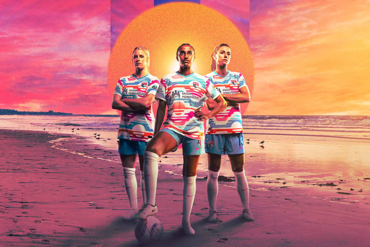
Pink is what makes the Wave’s crest pop so it was a shame that their kits in their first two seasons were blue and white. That’s not the case anymore, with San Diego leaning all the way in on a bright pink that is going to look lovely on the pitch at the sun-drenched Snapdragon Stadium.
The Wave’s identity is really starting to come into focus now.
The art deco elements of Angel City’s first primary kit are gone, replaced by a wing design that is supposed to evoke the club crest. It’s a pretty good effort and, from certain angles, it looks exceedingly ACFC. From others, the wing gets kind of lost, which is a shame.
For pink to be such a central part of the crest and such a small part of the primary kit remains a bit odd, but it’s a sharp kit, nonetheless.
When your colors are spectacular, you don’t have to work too hard with your kit.
That’s the case with Racing, which went with the deeper purple of the fleur de lis on its crest with this one that makes the beautiful crest really pop. It didn’t do much other than let its colors sing, and sing it did.
The Spirit seem to be in an odd transition period with their branding. Owner Michelle Kang is pushing changes with colors — the club has gone from red and navy blue to black and shades of yellow that the NWSL’s official design guide calls “lemon venom” and “light zitron yellow.” And yet, the crest remains unchanged.
Those new colors are really on display with this kit, as Kang’s adored bright yellow takes center stage and it looks good. The gradient demanded by the Nike template does this kit a lot of favors, helping soften the yellow and also keeping it from looking too much like a Pittsburgh-esque yellow and black. This is the best of the template bunch.
It’s wonderful to see Gotham sticking with the sash. It’s a tremendous and underutilized design mark and hopefully the club makes it permanent. The black and sky blue are a distinctive color pairing that will make any soccer fan see this kit and immediately know what club this is, especially with the sash.
The best thing a kit can do is identify the club at even the quickest glance, and Gotham FC is making that happen.
The Courage’s kits have been mostly forgettable and their previous primary shirt was an ugly gradient — so the bar was pretty low for North Carolina this time around.
They cleared it with ease, using triangles that represent the Research Triangle of their home in a style that looks very retro. Call it overly ’90’s or maybe even looking like a carpet design, but it’s got personality. This club has been crying out for a kit with personality, so this is a home run.
As discussed for Seattle’s secondary kit, the return of the lady of the Reign to the crest and the great kit sponsor do a lot of heavy lifting, but it is especially good on this year’s primary kit. Navy blue and gold go together beautifully and the gold makes the crest and kit sponsor really pop.
This is simplicity at its finest.
The Spirit are back in black for a second straight year and it feels like that’s going to be a permanent move. The design elements on this shirt are a welcome change as the gray provides some texture and the whole look is pretty smart.
It’s easy for black kits to lack personality, especially as so many clubs adopt them, but that’s not the case with this one. If they are going to make yellow a permanent part of their color scheme going forward, as their secondary kit indicates, then that will be another trim color that could aid the Spirit’s primary black uniforms going forward too.
Houston is stuck in a bit of an odd place. Its orange is immediately recognizable and gives it a unique identity, but how many different ways can Houston produce that distinct color?
The Dash found a way this season with the typical black trim aided by some white and star-dotted elements. The more you look at it, the better it gets. This might be the Dash’s best kit ever.
The Red Stars have had some of the best kits in league history and this year is another entry in their long list of great looks. They’ve smartly ditched the black primary kits of the past two years and are back to blue. The shade is nice, it complements the white well and even the darker blue kit sponsor suits the shirt.
The only thing this kit could have done better is a little extra splash of red beyond the sleeve trim. They are the Red Stars after all, but this is a fabulous look to welcome in the new ownership group led by Laura Ricketts.
This kit screams “SAN DIEGO” and that’s a huge compliment. There’s no doubt that this is a Wave kit, and it really harnesses the breadth of the color palette that makes the club’s crest so distinctive. Everything from the ocean to the setting sun is clear in this kit, and the blue shorts keep such a bold kit from becoming too much.
It’s exquisite in every way and what the club needed to cement its visual identity after a couple years of uninspiring threads.
The Pride have always put purple front and center, mimicking their MLS counterparts, Orlando City SC. This season, they walked away from that with a bold citrus kit. It both sets them in their Florida home and also makes them stand out from any other uniform in the sport, let alone just NWSL.
Orlando cooled its orange on the kit just a bit and that was a really smart decision to keep the kit from skewing too close to Houston or being overwhelming, while the cool blue leaves are a delightful touch that adds texture. You’re going to see fans at Pride matches wearing this kit 20 years from now.
Racing has a first ballot inductee into the Kit Hall of Fame with this argyle beauty. It could not have done a single thing better.
The lavender always looks good, but the white diamonds look terrific without being overwhelming and the darker purple front kit sponsor and Nike swoosh go perfectly with the crest. At every step, Louisville did everything right. If Racing wanted to never make another kit and wear this one every year, nobody would complain.